Creating an animation about epigenetics
Biomedical visualization master’s research project
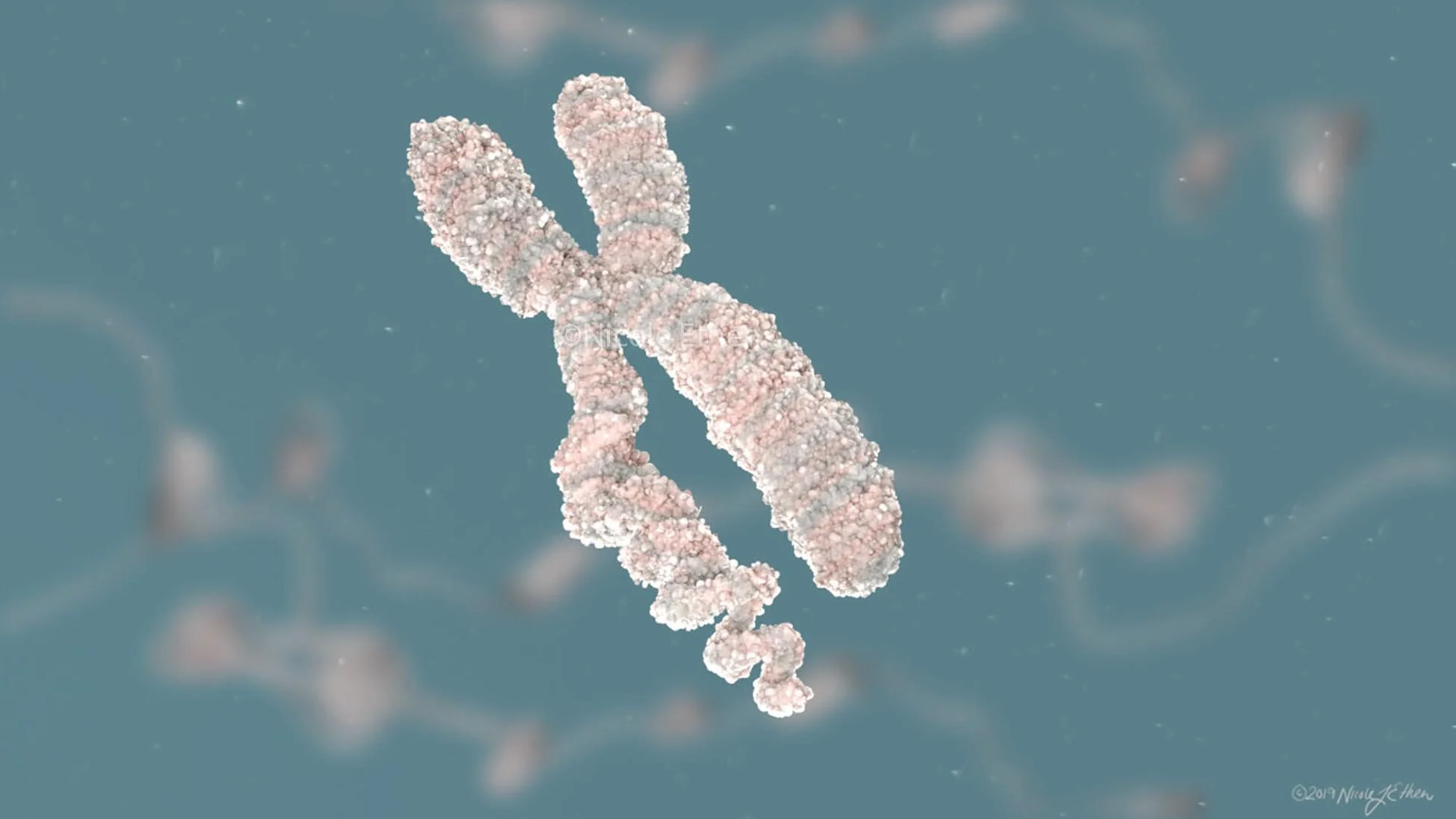
Part of the requirements of the Master of Science in Biomedical Visualization program at UIC are to create and conduct a research project that either answers questions that inform the literature of our field or solve a problem via some form of visual stimulus. I partnered with Northwestern University to create an animation explaining chromatin biology and why it is an important field to study. In addition to educating the public, this animation was intended to advertise for the brand new building and center dedicated to the advancement of scientific knowledge related to the field of epigenetics: the Simpson Querrey Center for Epigenetics. I created an animation designed to be watched alongside two of my classmates’ research animations for use by researchers at Northwestern University.
These projects begin with extensive background research, outlining the learning goals and visual story, creating the storyboard and narration, and finally creating all digital assets to create the animation.
I was interested in whether 2D or 3D visual styles would influence learning or interest as well as the addition of text onscreen.
establishing the content hierarchy
After researching and compiling the information to be conveyed, it was necessary to select which information will be shared with the audience in under 3 minutes. This was a challenging process as it seemed wasteful to eliminate every piece of pertinent information to the topic. The key was to break down the information into core elements and carefully scaffold more knowledge on top of this base layer of information. One benefit of using animation as the media of communication is the opportunity to include more information in the form of visuals that are not necessarily emphasized in the narration.
An early version of the first page of the storyboard. The first frame was the only part that remained after multiple storyboard revisions.
The first page of the approved storyboard, including a motion graphics title scene.
Scientific accuracy
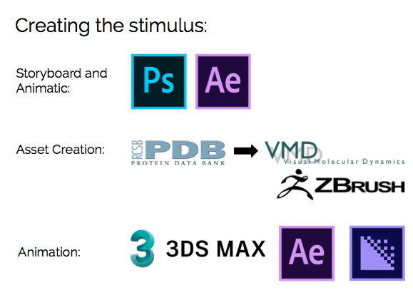
Scientific accuracy is always first and foremost a priority. In order to make the animation as accurate as possible, 3D data from the protein data bank (PDB) was accessed to create the 3D models for the applicable molecular elements. Not all elements in the PDB (in fact very few) were complete models. It was important to me to create the models using accurate scale in proportion to each other. So the models that were incomplete were filled in using either homology models or prediction models such as ITASSER. While not completely accurate, these provided at least a prediction of how these proteins might look in real life.
A screenshot from VMD of the DNA methyltransferase 3 (DNMT3) with important structural features noted.
Modeling and simplification of the histone octamer
A screenshot from VMD of the histone acetyltransferase PCAF with important structural features noted.
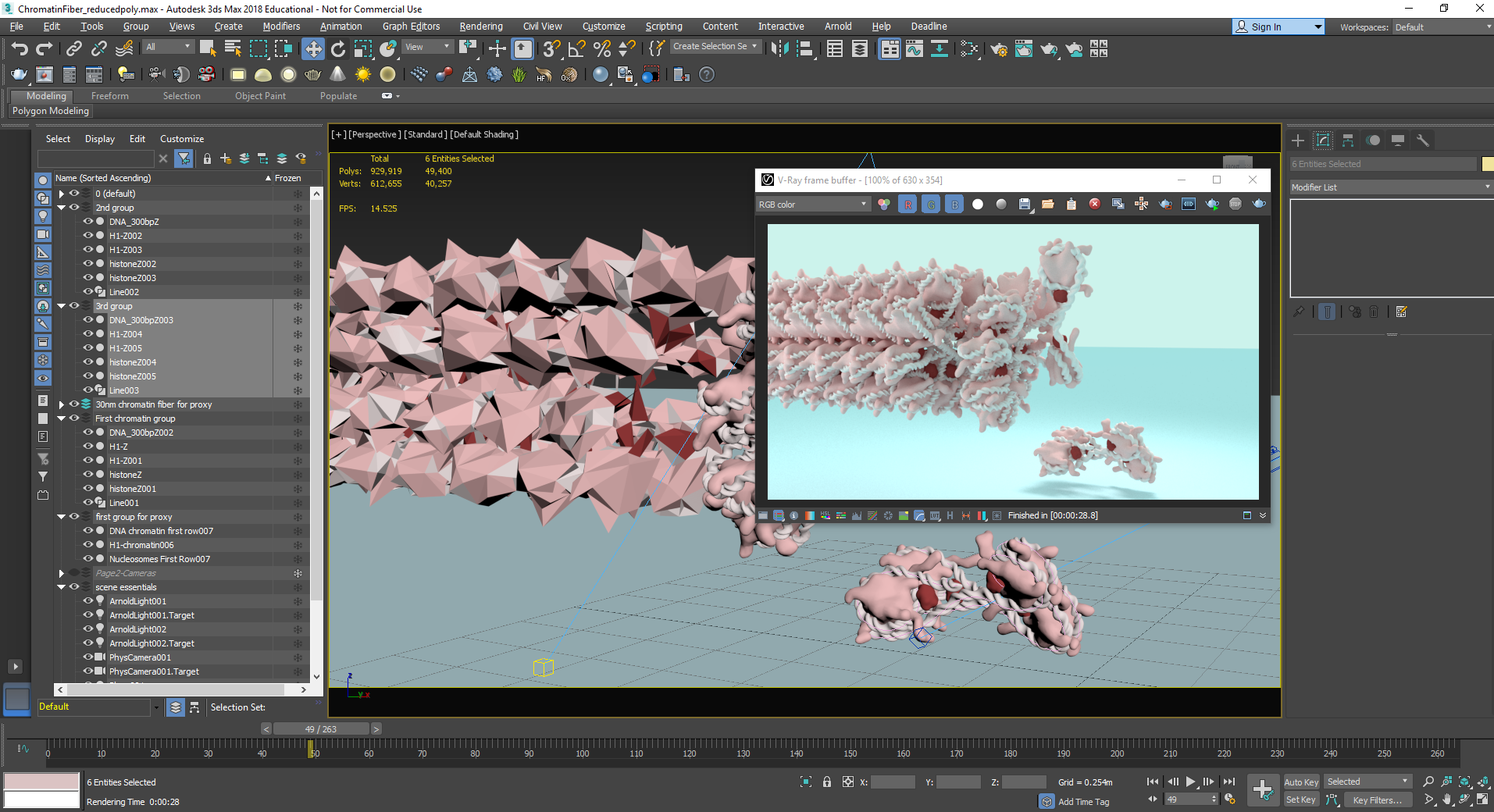
A screenshot of the workspace in 3ds Max while creating the chromatin fiber and compacting nucleosomes.
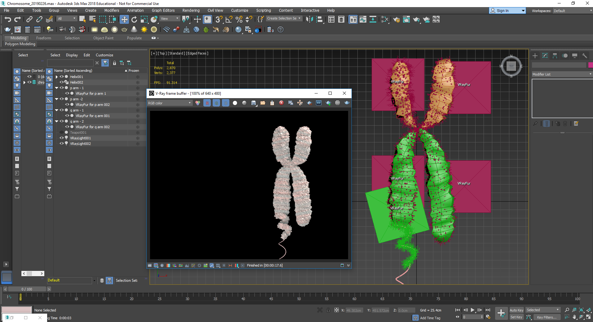
A screenshot of the workspace in 3ds Max while exploring different ways to compact the chromatin into the chromosome.
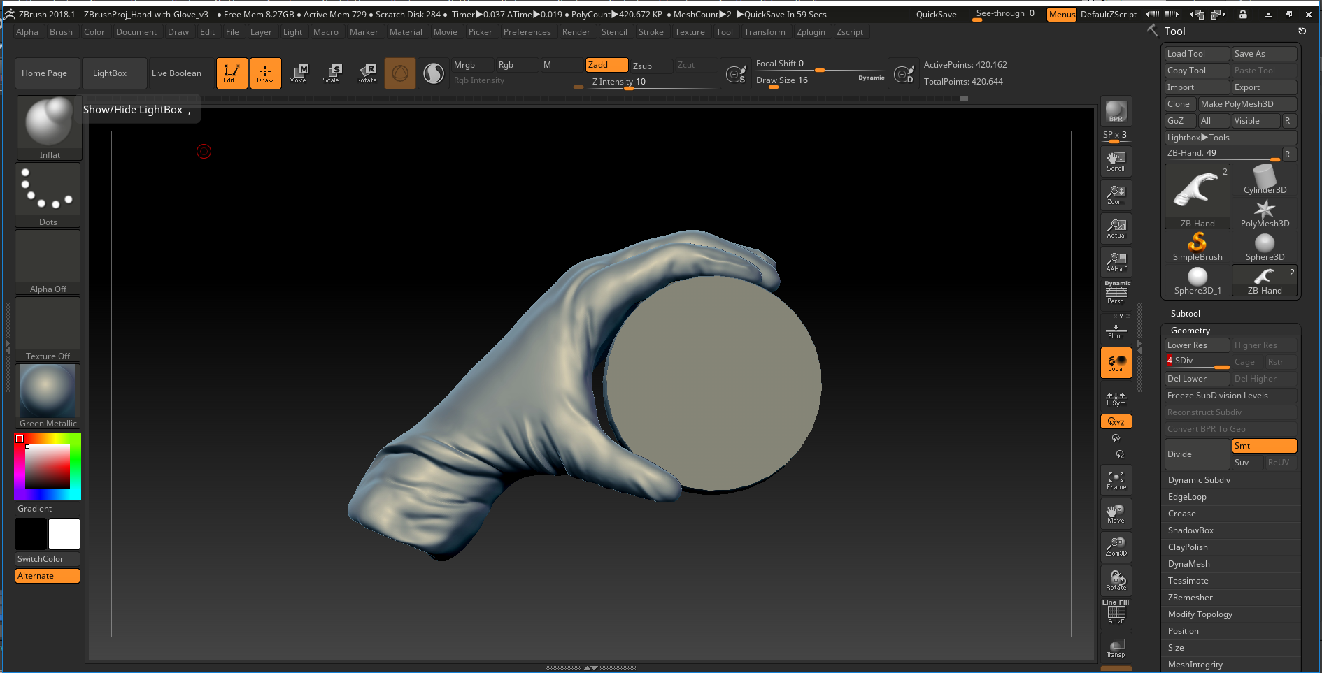
A screenshot from ZBrush of the gloved hand that was modeled and later animated. High poly meshes were projected onto a low poly object in the final animation.
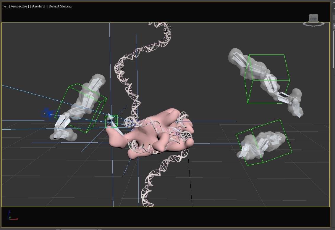
A screenshot of the workspace in 3ds Max showing the helper objects used to animate these elements such as splines, dummies, point helpers, and bones.
VISUAL STYLE
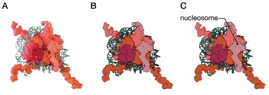
Many of the design decisions for this animation were made as a team with my two other classmates who were creating animations for Northwestern University: Dani Bergey and Ann (Hui) Liu. All three of us had different audiences for our animations. We made design decisions to unify the animations as a collection and to allow the animations to work best for each of our audiences. For example, a high-radius surface model was used to depict the proteins as research has found that high-detail surface representations of proteins can be overwhelming and distracting to a lay audience. The DNA was depicted using two representations, depending on the mechanism being displayed. A surface model representation for the DNA was used in my animation when the focus was on histone modifications and a ribbon model representation was used when the focus was on DNA modification. This served two purposes: to shift the focus of the viewer and to get a lay audience to connect the two different representations of DNA as models of the same structure.
A style shot from the 2D version of the animation that was tested on participants.
A sketch from a frame in my storyboard….
I had to exercise my graphic design skills in order to make this lengthy title more approachable.
….to a test render of the models and materials and preliminary liquid simulation.
ANIMATION
The final animation was created using Autodesk 3ds Max and Adobe After Effects.


